Seeing the forest for the lines - Scaling complex base plots in Shiny
Introduction
I’ve been working with base plots in Shiny recently that have been creating difficulties with achieving the desired behaviour in various aspects of scaling. In short, I want plots to display with legible text, without whitespace around them, without cutting off areas of the plots and to respond to screen size. The plotting functions are all from established packages for conducting meta-analyses, so I don’t have any option of using alternatives, both because they are very good at what they do, but also because their code is well-validated. I couldn’t find a solution elsewhere, so thought it would be sensible to share what I have come up with.
Here is a screenshot of the existing app to demonstrate the problem:
Whilst the plots are visible they are very small and if you decrease the size of the window, they will eventually start to get cut off. Users can upload datasets of various sizes and consequently, both the width and the height need to adjust depending on the data which means calculating a sensible width and height for the plot and providing them to renderPlot().
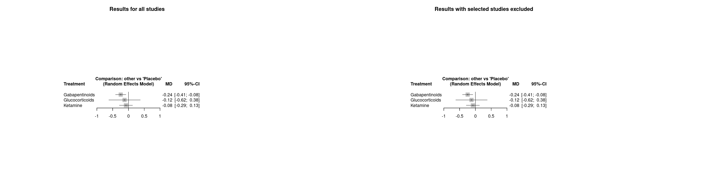
An interactive example
This plot is different to that shown above, but created with the same function (meta::forest()) and demonstrates the same difficulties, but using example datasets and manually set widths and heights. In this example, you can see various problems:
Make the width too narrow and the edges of the plot disappear
With the default plot height, there is a lot of whitespace
However you change the width and height of the plot, you can never make the text larger
Switch to the woodyplants dataset (a very appropriate name!) and you’ll never be able to fit the whole plot on the page
View code chunk
library(shiny)library(bslib)library(meta)ui <-page_sidebar(theme =bs_theme(version =5, "darkly"),sidebar =sidebar(selectInput("dataset", "Dataset", choices =c("Olkin1995", "woodyplants")),sliderInput("width", "Plot width (pixels)", min =100, max =1000, value =500),sliderInput("height", "Plot height (pixels)", min =400, max =1000, value =400) ),plotOutput("plot"))server <-function(input, output) { output$plot <-renderPlot({if (input$dataset =="Olkin1995"){data(Olkin1995) m <-metabin(ev.exp, n.exp, ev.cont, n.cont,data = Olkin1995, subset =c(41, 47, 51, 59),sm ="RR", method ="I",studlab =paste(author, year)) }if (input$dataset =="woodyplants"){data(woodyplants) m <-metacont(n.elev, mean.elev, sd.elev, n.amb, mean.amb, sd.amb,data = woodyplants, sm ="ROM") }forest(m) }, width = \() input$width, height = \() input$height )}shinyApp(ui = ui, server = server)
#| '!! shinylive warning !!': |
#| shinylive does not work in self-contained HTML documents.
#| Please set `embed-resources: false` in your metadata.
#| standalone: true
#| viewerHeight: 1000
library(shiny)
library(bslib)
library(meta)

ui <- page_sidebar(
  theme = bs_theme(version = 5, "darkly"),

  sidebar = sidebar(
    selectInput("dataset", "Dataset", choices =  c("Olkin1995", "woodyplants")),
    sliderInput("width", "Plot width (pixels)", min = 100, max = 1000, value = 500),
    sliderInput("height", "Plot height (pixels)", min = 400, max = 1000, value = 400)
  ),
  plotOutput("plot")
)

server <- function(input, output) {

  output$plot <- renderPlot({
    if (input$dataset == "Olkin1995"){
      data(Olkin1995)
      m <- metabin(ev.exp, n.exp, ev.cont, n.cont,
                    data = Olkin1995, subset = c(41, 47, 51, 59),
                    sm = "RR", method = "I",
                    studlab = paste(author, year))
    }
    if (input$dataset == "woodyplants"){
      data(woodyplants)
      m <- metacont(n.elev, mean.elev, sd.elev, n.amb, mean.amb, sd.amb,
                     data = woodyplants, sm = "ROM")
    }
    forest(m)
    },
    width = \() input$width,
    height = \() input$height
  )
}

shinyApp(ui = ui, server = server)
An explanation
The reason for the plots being cut off when the width is too narrow is because all of the annotations are in the plot margin and the margin units are set in inches which cannot be changed from being 0.2 inches. By default in shiny, plots are displayed at 72 dpi (dots per inch / pixels per inch) and so each margin line is always rendered as 14.4 pixels, imposing a minimum width on the plot. If the space available for the plot is insufficient, then there is no space left for the plot area (i.e. not the margin) and an error occurs (either figure margins too large or invalid graphics state, depending on whether the previous change was due to the margin changing or the plot size changing respectively). Using this example with 10 margin units on each side of the plot, these take up 288 pixels and the plot area takes up the remaining space.
#| '!! shinylive warning !!': |
#| shinylive does not work in self-contained HTML documents.
#| Please set `embed-resources: false` in your metadata.
#| standalone: true
#| viewerHeight: 1000
library(shiny)
library(bslib)

ui <- page_sidebar(
  theme = bs_theme(version = 5, "darkly"),

  sidebar = sidebar(
    sliderInput("size", "Width and height (pixels)", min = 100, max = 1000, value = 288),
    sliderInput("margin", "Margin (lines)", min = 1, max = 20, value = 10),
  ),
    uiOutput("details"),
    plotOutput("plot")
)

server <- function(input, output, session){

  output$details <- renderUI({
    line_height <- 0.2
    dpi <- 72
    margin_width <- line_height * dpi * input$margin * 2
    plot_width <- input$size - margin_width

    tagList(
      p("Margin width: ", margin_width, " pixels"),
      p("Plot area width: ", plot_width, " pixels")
    )

  })

  output$plot <- renderPlot({
    par(mar = rep(input$margin, 4))
    plot(1, 1, xlab = "", ylab = "", xaxt = "n", yaxt = "n")
    for (side in 1:4) mtext(1:input$margin, side, 0:(input$margin - 1))
  },
    width = \() input$size,
    height = \() input$size
  )

}

shinyApp(ui, server)
SVG to the rescue
In one part of the existing app, this was already causing a problem where three plots were being displayed side-by-side and even on a wide screen, the plot did not fit inside the column. As a workaround, the plot was being rendered to a png file and then read back in to display. This fixed the problem of the edges being cut off, but there was white space around the plot which made it especially small. This workaround got me thinking though and I thought it would be much better if instead of rendering the plot to a png, it was rendered to an svg (scalable vector graphic), which, if inside an appropriate container can always be scaled to fit inside. SVGs are a great format and use code to produce graphics in an analagous way to how html can be used to produce text.
svglite
Ideally, I was looking for a function that generates svg code, rather than writing to a file like svg() does to avoid writing and reading to file unnecessarily. After some searching I came across svglite::xmlSVG() which does exactly what I wanted. svglite::stringSVG() is very similar, but as we’ll see later on, getting the output as an {xml2} object rather than a character has advantages when it comes to editing. The svg code output of a very minimal plot is shown below, followed by the resultant plot. The paste(svg, collapse = "\n") here and elsewhere is needed to convert the {xml2} object to a string.
One problem I encountered with this is that the fonts are not automatically embedded in the svg, and so we need to add another argument to ensure that the text displays the same for all users. I haven’t been able to find a method to know what font the plot uses though, so I have to generate it first, inspect the code and then go back and add the required font.
We also need to calculate sensible values for width and height, but at least now we only have to do that once when we generate the plot and can rescale it however we like afterwards.
Cropping
This largely solved the problem in the app, but I’m also producing an html report and some of the plots had a lot of whitespace below them leading to gaps between the outputs in the report. I knew that I could crop SVGs by adjusting their viewBox parameter, which acts like a window into the canvas, but figuring out where the content would be from the code was difficult, if not impossible. Seemingly, the only way to do this is to render the svg to pixels, for example via paste(svg, collapse = "\n") |> magick::image_read_svg() |> magick::image_data(), and then search for the outermost pixels that aren’t white. I was worried this would be slow, but it ended up only taking ~0.1 seconds which seems reasonable enough.
The values for the viewBox are a little odd, as you specify the starting x and y coordinates followed by the width and height. I also wanted to add a margin around the content, so needed to add or substract that from the outermost pixel coordinates.
Further annoyance came when I went to download the plots as pngs rendered from the svg and found that some of the background was transparent. I’m not sure why this happens as the background was already set as <rect width = "100%" height = "100%" fill = "white"/> but after some fiddling, I found I could get the desired result by hard-coding the width and height in pixels instead and this is where having the output as xml came in handy:
The next step was to make a container div to put the plots in to, enabling the plots to scale dynamically. We need two css rules - one for the container and another for the svg inside it. These are basically saying, take up as much width as possible and adjust the height accordingly i.e. maintaining the aspect ratio. Adding a max-height: 90vh might also be sensible, to ensure that very tall plots will always be entirely visible.
There are a number of side effects caused by this, first the plot generation can be moved entirely to a function, moving code away from the server function and making it easier to write tests for. Second, whilst we still need to provide a width and height to svglite::xmlSVG() we only need to worry that the plot will fit inside those dimensions as crop_svg() tidies everything up. Thirdly, the svg can be rendered to other file formats (pdf and png) and produce exactly the same plot as the user sees on the screen. Whilst the rendering from pdf()png() and svg() is pretty similar, there are small differences in text rendering which to a pedant like myself was annoying. Unlike before, we can also call the plotting function once in a reactive() and then use the output to generate the plot and the download, rather than calling the function again. If users download the .svg then they are also much easier to edit if they need to than as pngs or pdfs, which are the main options in the existing version.
The downsides compared to before are that the plots aren’t easily edited inside R and to be displayed in Rstudio, they need wrapping in htmltools::HTML(). Both of these would relatively easy to resolve though by adding a parameter to determine what type of output the functions produce - either the svg code, the svg wrapped in htmltools::HTML() or writing to the graphics device.
End result
Here’s the same interactive example after giving it the treatment. Now the plot can scale whatever the size of the container.